Launched
Chase Spending Summary
Help customers track their spending over time
I led the design enhancement of Spending Summary, refining existing tools and introducing intuitive new features to empower customers in taking more control of their finances.
2023 Fintech Breakthrough Award
- Best Finance Product
My role
UX Designer, Design Strategist
Timeline
Mar 2023 - ongoing
Team
2 UX Designers
2 Content Writers
3 PMs
1 UX Researcher
Platforms
Native app (iOS, Android) , website
A disjointed customer experience
Spending Summary aims to empower users with a streamlined, user-friendly tool that integrates directly with their accounts, providing real-time spending insights, automatic categorization of expenses, and easy-to-understand financial summaries to help users take control of their finances.
However, back in the days when Spending Summary was introduced, customers struggled to effectively use the tool. There were multiple features (Income & Spending, Spending Summary, Budget) that were intended to help the customer track and better manage their spending. The customer journey had been disjointed, with multiple tools that did not talk to each other and inconsistent data we display.
Income & Spending, Spending Summary (2021)
Budget tool (2021)
One seamless, better, and more intuitive experience
The goal of the project is to unify the various tools, creating a more cohesive and integrated experience for customers. Additionally, we aim to enhance the existing tools, making them more powerful and user-friendly, while establishing a solid foundation to help customers take better control of their finances.
Our high level goals are:
User comprehension
Ensure the financial data are easy to understand for customers of all financial literacy levels without overwhelming the users.
Integration, accuracy and consistency
Seamlessly integrate Budget with Spending Summary and provide consistent data, ensure all transactions are accurately captured.
Actionable items
Provide actionable insights and suggestions on how to improve customers’ spending behaviors.
Does the current Spending Summary meet expectations?
Using the Qualtrics Analytics tool, we observed a consistently low satisfaction score (27%) for the Spending Summary over time. Additionally, we gathered negative feedback from customers, which helped us pinpoint key areas for improvement. Our analysis revealed UX issues related to usefulness, control, and information, highlighting opportunities to enhance the overall experience.

Data Visualization
"The chart is confusing at first sight, but it makes more sense after having the context. Don’t actually know what it means when I first looked at it."

More spending Insights
“It would be good to work in non-recurring but frequent expenses like coffee at Starbucks every morning. I don’t know if this functionality is in the app and I would love to see it as a part of this experience.”

Re-categorize transactions
“Your tool doesn’t work. I keep trying to reclassify transactions but nothing happens and it’s really hard to use when it’s completely inaccurate. It would be wonderful, if it would work properly.”

Year-end reporting needs (e.g. taxes)
“I would like to download the yearly spending summary with all the transactions as an excel or CSV file so I can format and manipulate it. I am not interested in the spending summary as a planner but as a record of transactions for my taxes. ”
Spending Planner — Set the foundation for customers to fully track and manage their spending
Our vision for Spending Summary was to integrate it with the Budget tool (also known as Spending Planner) and enhance its existing features, enabling users to fully utilize the tool for tracking and managing their finances.
Beyond simply tracking spending, we aimed to shift users’ mindsets toward spending more wisely and developing good financial habits. We envisioned the future of the Spending Planner as an all-in-one, reliable tool that offers personalized insights and actionable steps to help users make better financial decisions.
Timeline:
Phase I (Apr 2023)
Introducing Spending Planner, better integrating Budget with Spending Summary
Phase II (Oct 2023 - Apr 2024)
Enhancement to Spending Summary: new data viz, re-cat, exclude, add bar charts to transaction dip
Phase III (Nov 2024)
New features: Merchant tile, Web UI enhancement, Visual uplift
Phase IV (2025)
Future state: Spend categorization rules, Recurring bills, etc.
How might we help our customers reduce friction and integrate Budget with Spending Summary?
Our goal is to boost usage by consolidating and integrating data into a more seamless experience that helps customers clearly understand their financial standing. We aim to provide them with the tools they need to manage all their spending effectively while encouraging saving—whether for occasional treats or future financial goals.
Detached Spending Summary and Budget that don’t talk to each other
Spending Planner, a more integrated experience
How might we help our customers easily see if they are spending within their means?
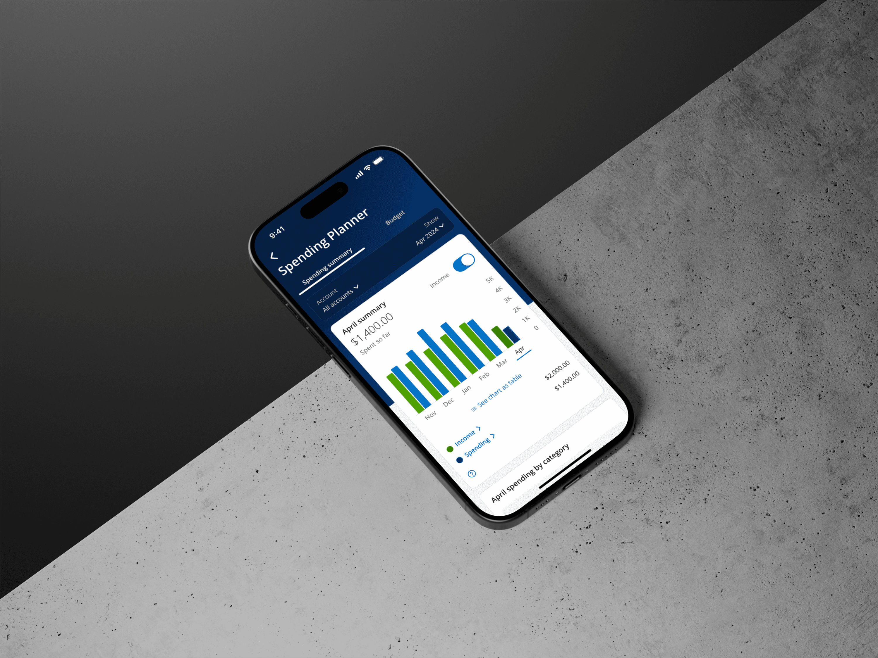
We are integrating income into Spending Planner, providing users with a simplified view to easily see if they are spending within their means
Easily compare spending with income
View income and spend side by side in a bar chart; See the difference in income and spending for previous time periods
Different view options
View spending and income transactions (in less clicks than the previous experience); Switch between different time periods (M/Q/Y) in a more simplified view
How might we help our customers have more control over the spend?
We are providing users the ability to exclude and re-categorize transactions from their spend totals, giving them more control over what they want to track
Exclude transactions
Ability to exclude transactions from spend tracking/totals
Re-categorize transactions
Ability to re-categorize transactions from spend tracking/totals
Additional feedback survey entry via SS tab (allow to gather user feedback from all SP users)
Increase customer satisfaction, grow Spend MAUs to 3M
Improve visibility of sorting transaction capabilities (Usage of sorting is low due to discoverability challenges; Allows users to easily see their largest transactions)
Grow repeat usage of SP
Easier access to Spend PDF report (PDF report is only accessible when users select an individual card account, creating discoverability challenges)
Increase customer satisfaction; Grow repeat usage of SP
Increase awareness and discoverability of new features (Ensure users discover new capabilities that we have added)
Grow Spend MAUs to 3M; Grow repeat usage of SP
Identify the target users and learn from them
I assisted in the user research session and helped conducting 12 qualitative user interviews to gain a better understanding of our customers’ spending behavior, and learned how users interact with the experience. Some key insights we collected are as follows:
Behavior:
Only looks for reassurance that their financial standing is good.
Likely heavily dependent on things like autopay features.
“Make it as easy as possible.”
Financial type:
Log onto the Chase app occasionally to check balances and transactions.
Looking for ways to improve financial habits
Tend to spend more than they save
Learn from our competitors
Next, to better understand how other digital tools work, I conducted a competitive audit of a few competitors’ app. This helped us analyze strengths and pain points for each of the digital experiences, and identify opportunities and areas for improvements.

Rocket Money (truebill)

Mint (decommissioned)
Walking thru in our customers’ shoes
As a team, we listed out all the features provided by current Spending Summary, and identified opportunities based on user feedback. We evaluated user emotions by analyzing the user journey map and determined the desired takeaway from the enhanced experience.

Core task & key opportunities

Perceived emotions
Building the MVP and set the vision state
We collaborated with the engineering and product teams to assess the effort and customer value of each feature, defining our MVP experience.

User value vs tech compexity
Satisfaction
49%
78% increase
Monthly users
3.3M
2x increase
Retention
27%
23% increase
Our customers are enjoying the new Spending Planner, though they need more robust functionalities:
Custom/additional categories
“I would like to have more categories available for expenses. Beyond simply "Food & drink" I would like to separate Restaurants from Fast Food. Instead of just "Groceries" I would also like a category for Pet Food & supplies. I want more granularity in tracking my budget. This is what Mint had, so it is an opportunity for you to replace their functionality.”
Rule based categorization
“I would like to put a spend in one category and have applied for all the other spends in the past and to come. E.g. I want to put all Target Purchases in Groceries once and for all and not having to do it for every single purchase that's done.”
More spending insights
“It would be good if we could have more granular breakdowns by recurring vendors (Uber/lyft for ride share, DoorDash/caviar/Grubhub for ordering in food)”
Recurring/upcoming bills
I like the budget but why aren’t my bills showing up on here? They should be taken out of what’s left to spend.
Easier access/reminders
“I’d like an alert setting on when i get close to and go below each category in my budget.”
“I’d like to be able to see this interface in my homepage when I open the app.”
Year-end reporting needs (e.g. taxes)
“I would like to download the yearly spending summary with all the transactions as an excel or CSV file so I can format and manipulate it. I am not interested in the spending summary as a planner but as a record of transactions for my taxes. ”
How might we help our customers see multiple information at once on web?
We are providing a new layout that allows users to see and find information, and allow web users to download year-end report in different format so they can file their taxes more easily.

PREVIOUS WEB SP UI

NEW IMPROVED WEB SP UI
How might we help our customers better understand their spending habits and keep track of their “mindless spending”
We are providing a view of the merchants they spend the most at and transact the most with. Customers will be able to easily see how much and how often they spend at their top merchants.
MERCHANT TILE ON SP DASHBOARD
MERCHANT DIP SCREEN
How might we provide our customers a more visually appealing/colorful screen to elevate the experience?
We are now providing an updated gradient app header to match across channels and bringing a more colorful and pleasing experience.
Old SP Dashboard
New SP Dashboard
How might we help our customers to personalize their categories to match their spend tracking so that they can track what matters to them?
We are exploring how to address several customer pain points through three types of enhancements to spend categorization (Re-categorization rules, new preset categories and custom categories)
Customers pain points:
There are not enough categories for expenses, customers are looking for more choices, and the option to create their own categories, which is available in our competitors’ apps
Customers would like to put a spend in one category and have applied for all the other spends in the past and to come instead of doing it for every single purchases
RE-CATEGORIZATION RULES
More granular, preset categories, CUSTOM CATEGORIES?